From loans to savings, simplifying everything.
Reimagining finance for The Philippines.

TLDR;
SAVii, a salary-linked loan platform for employees in The Philippines, faced high drop-off rates throughout their loan application process. As Product Designer II, I led a 6-month redesign using data-driven insights to identify three major friction points: lengthy application forms (12% drop-off), cognitive overload on loan offers (14% drop-off), and poor document upload readiness (25% drop-off). The solution reorganized information flow into logical steps, streamlined decision-making through progressive disclosure, and enhanced user readiness with upfront guidance. This resulted in an 11% decrease in drop-off rates, 2x increase in first-pass document approvals, and positive user feedback.
TEAM
Harika K, Design Manager
Me, Product Designer II
Tavishi B, Product Designer
MY ROLE
Individual Contributor, leading product design from research to development.
DURATION
6 months (April 2023 - September 2023)
About SAVii
A platform offering salary-linked loans and financial wellness tools to empower employees through easy access and education. It partners with employers to provide responsible credit access and promote financial literacy among the workforce.
Let's understand the problem better, through Marco's story


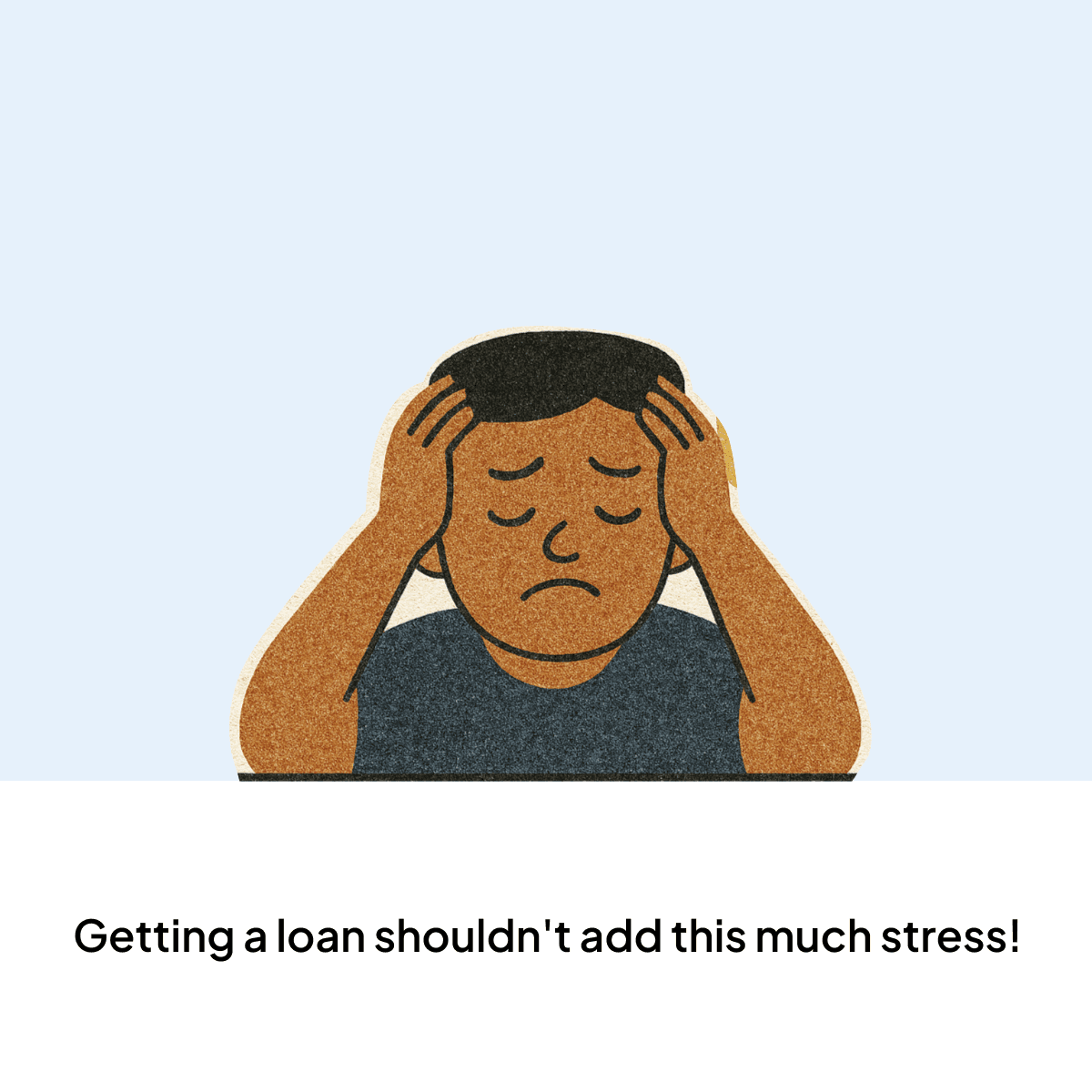
The Problem
01
High drop-off after sign-up
Many users don’t complete their loan applications after creating an account, leading to low conversion.
02
Reduced loan approvals
Abandonment in the early flow prevents potential customers from securing loans they need.
The SAVii turnaround
01
Reorganized fields
Grouped inputs logically to reduce cognitive load and improve flow clarity.
02
Used progressive disclosure
Deprioritized less critical fields to help users focus on one task at a time.
03
Simplified complex steps
Split overwhelming tasks into smaller, manageable actions to ease completion.
Impact
✅
11% positive decrease
in loan application drop-off rate. (Measured within 2 months of changes to high-friction screens)
✅
2x increase
in first-pass document approvals (Fewer errors and resubmissions observed)
✅
Positive feedback
by users that completed their application. (Collected via in-app surveys and support tickets)
Let's deep dive into the Process
Problem with the older design
Data Insights
We analyzed user metrics across the entire funnel to pinpoint exactly where users were dropping off and identify opportunities for design improvements.
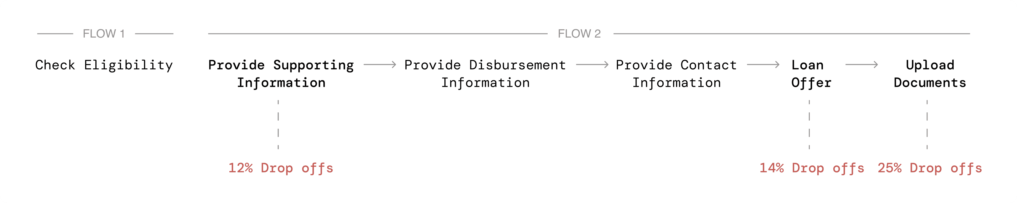
Click data revealed three major steps with significant user drop-offs

Talking to Users
We spoke with 12 users to understand their views on loans and why they dropped off—some had only signed up, while others started the application but didn’t finish.

discoveries to actionable insights
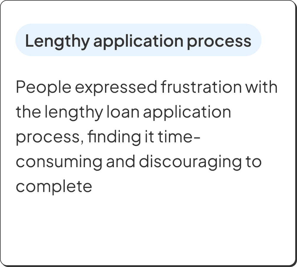
From funnel analysis and user interviews, we gathered key insights and identified 3 major problems to solve.


Welcome to the Solution Space
Time to turn the insights - application fatigue, cognitive overload, and lack of readiness into thoughtful design solutions. The goal? Make the journey feel less like a maze and more like something you can actually get through without sighing every 10 seconds.
lengthy application -> step by step information
Users dropped off early due to a long, confusing form with no clear sense of progress. We found 12% of drop-offs happened during the supporting information section.
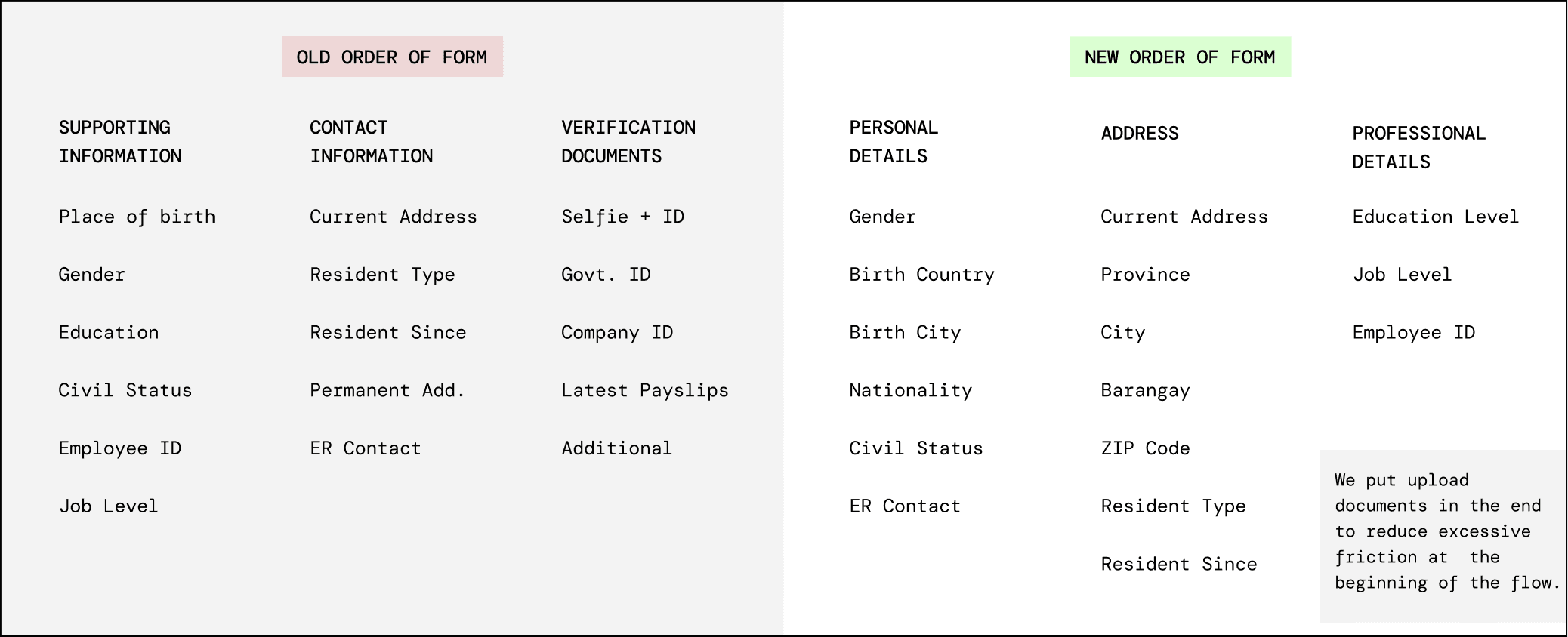
The SAVii team wanted to keep the original funnel for accurate before–after comparisons, so we refined field labels and adjusted page divisions without altering the core structure.
01
Grouped fields more logically (Personal, Address, Professional)
02
Reduced perceived effort by breaking into 3 smaller steps
03
Moved document uploads to the end to ease early-stage friction
Cognitive Overload -> Streamline & Simplify
We identified a 14% drop-off on the loan offer screen and conducted an audit to uncover friction points. Using user feedback, we prioritized key decision-making factors and applied visual hierarchy and progressive disclosure to reduce cognitive overload.
01
Optimized decision making
02
Calculations on progressive disclosure
03
Clear communication

Lack of user readiness -> FLEXIBLE OPTIONS
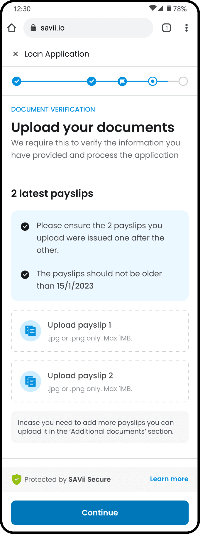
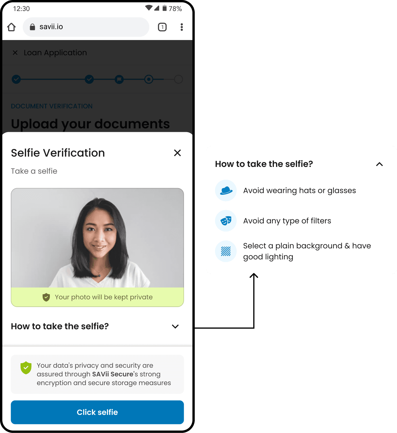
The upload documents screen had the highest drop-off rate at 25%. We analyzed user interviews to uncover pain points and translated them into focused HMW questions to guide ideation.
01
Added a clear checklist and final-step reminder to help users feel prepared before starting the application.
02
Introduced a checklist and pre-submit reminder to boost user readiness from the start.
03
Enabled document previews with tips to help users capture clear, high-quality images confidently.


Reflections & Learnings
✏️
Working with constraints
We improved the user journey by refining the flow and visuals, making the experience more intuitive despite system limitations.
✏️
More room to simplify
So much more can be done. The document upload step still feels heavy. Reducing input fields and removing redundancies can further streamline the process.
✏️
Scalable design impact
We built a reusable component library for SAVii, which not only improved consistency but also led to future collaborations on new features and a full website redesign.